There have been lots of updates to WallpaperFusion over the last two weeks, here are the highlights!
First, we have a new WallpaperFusion Logo that we're excited to unveil! You can check it out on Facebook, or the official WallpaperFusion Twitter page.

We've made several additions to profile pages. First up, you now have the ability to show off your hard-earned WallpaperFusion Reputation on other websites by displaying your personal profile card. This is currently available in two colour themes:

Visit your member page and follow the link to "Show off your reputation" under your Gravatar to get started!
We've also made it easier to keep tabs on the images you've submitted, with a new section on your member page. You can now see all the comments you've received on your images together in one place under the "comments on my images" tab. We hope this makes it easier to see what people are saying about your images and you won't have to worry about missing out on any feedback or praise.
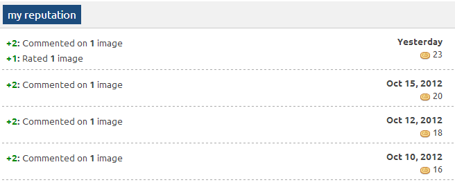
Another addition to the member profile page is the "my reputation" tab, where you can see a day-by-day breakdown of where you gained all of your reputation points.

Finally, we have also changed the way that we set the number of monitors on an image. We've received lots of feedback about images being automatically set to fewer monitors than they could support, and we hope that this will more accurately assess all our submissions!
A big thank you to everyone for their excellent image submissions, and for all the feedback and suggestions about the site. The site is growing everyday, and it's all thanks to our amazing community!